Friday, September 21, 2007

My Crappy Compositon =]

Photo Sharing and Video Hosting at Photobucket


soommmebody critiiiquuue mee!!!! =]=]=]

Tuesday, September 18, 2007

Value

Ok, so I understand that value can be used in our art. Ya know going from light to really really dark. But until Brian brought up that chart, I've never thought of value like that in any way shape or form. Of course I know the whole deal with getting a job and making money -- that to me is just something we already know in a way, it's one of those things that's just a natural thought that I really don't think about it unless it's brought up. It's funny that an artist can put a fancy label on anything and it'll be more expensive then the same thing that's only a $1.50. I know it sounds funny but that's the only thing I could think of the whole time our class talked about it. How to me none of that really worries me, because it's really not like I'm gonna change anything about value and the way things flucuate in price and what not. So to me it's just something that's in the background of my life. Hopefully I'll become an art teacher and I'll make money, but that's how I expect it to be-- because it's a job. Out of sight, Out of mind -- i don't have a pocket value chart with me at all times so thats how i kind of think about things likke that (no not my boyfriend haha) but when it comes to value, I guess so.
But I did learn more about what I didn't really understand. So I did get something out of this. That as artists we can add value to something that is virtually the same all around.

Damn art students<3

Tuesday, September 11, 2007

String Activity

I thought that the string activity was cool because we were all connected some way or another through line. The only shapes I saw here triangles and some parallelograms here and there (is that how it's spelt??) just because of the way it was all strung together. I didn't think that it was too lame, I thought it was kind of fun. I kept trying to connect lines together so that they could make like a teepee form haha just so you can actually see the string better . I wasn't really surprised by the way it looked in the end, I was kind of expecting it to look all strung together like a web. The only thing I don't like about this activity is the fact that as soon as I'm done writing this.. we're probably gonna have to go unstring it all.

Line and Shape


Q: Which of the images a, b, c, or d are lines?
Q: Which of the images a, b, c, or d, are shapes?
-- A: The only way I feel that I can answer these questions is to answer them at the same time. A, and C could be lines as well as shapes. I only say that because you can make lines that go from being really thin to really thick, especially with a sharpie marker. C could be a rectangle or just a really really thick, short line. B and D are the only two I want to say are only lines.

Q:What makes a line?
A:I think that movement, and mood can make a line.

Q:What makes a shape?
A:I think that form, movement, and mood can make a shape.

Monday, September 10, 2007

Kurt Wenner 3D Street Murals.

Photo Sharing and Video Hosting at Photobucket

Photo Sharing and Video Hosting at Photobucket

Kurt Wenner has been known for his street painting and chalk murals using a projection called anamorphosis. He has been doing it since the 1980's and they say he's one of the first artists to really do 3D street paintings. I just think that it would be really cool to see one of his murals on the sidewalk. Imagine thinking your gonna fall through the pavement when you suddenly realize it's only an illusion? Seriously, since seeing his artwork I thought it'd be good to practice techniques to become good at something that.

ok, later gators =)

Sunday, September 9, 2007

My First Critiquing Assignment

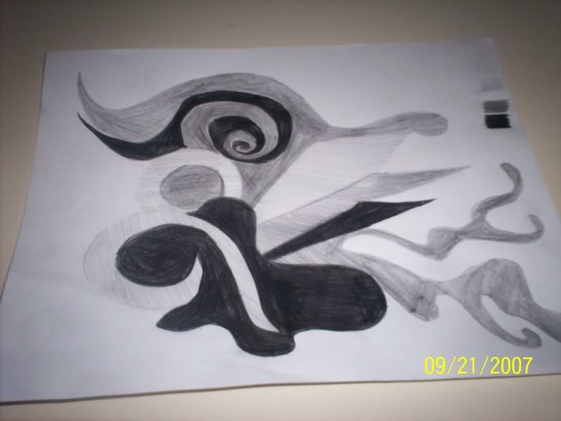
Describe: In the image that I picked, there are all sorts of different colors exploding in the viewers face. It also looks as if there are soft exploding clouds all the way to the right, and it gives me a cluttered feeling.
Interpret: I feel like the artist wanted to to look noisy. In the middle there is a shape that seems to suggest the shape of a horn, which right beneath it creates a shadow. I think that's neat because it makes that ONE item, the only REAL item in the picture seem more REAL. All the shapes are colliding together and it keeps making me think of a car accident. Everytime I look at it my eye moves from some weird gold shape all the way in the left, and the lines and colors move my eyes all the way up to the right where you can see something that resembles a cloud. More of like an explosive, uncomfortable, cluttered feeling.
Evaluate: I think that the artist did a good job with making the artwork color and shapes collide to give a messy feeling. But it's not something I like, mostly because I don't like the way it makes me feel and it's not really my style.

Tuesday, September 4, 2007

First Dayyy

and i'm beat since I hopped off a bus from NJ at 5 am last night and I hated my life the whole 4 and a half hour drive.
Don't poke me I'm cranky.